
The Canary
What Tarrant County's Regression Line Says About November - County Race by Race

As I write this, we are six months from the November 2026 election. Six months for campaigns to take flight. Six months for coalitions to come together to make a difference. Six months for the frontline of our democracy to show what is possible.
For most of the past decade, Tarrant County was Republicans’ most reliable talking point about Texas.
No Leigh, it’s not the reddest county in the nation. And it’s not the reddest county in the state. Glad that isn’t a title we hold. But it is the largest. The anchor. The proof that even in a major urban county with a diverse population and a growing Democratic coalition, and with Dallas to the east, it’s a place where Republicans could claim to hold the biggest urban / suburban prize in the country. Tarrant was the county that was supposed to stay red while everything around it shifted.
The 2026 primary results STRONGLY suggest that story has an expiration date.
Democrats cast 189,583 primary ballots in Tarrant County in March. Republicans cast 147,471. The D/R ratio: 1.29. For context, the highest ratio Tarrant had recorded in recent history in any cycle, midterm or presidential, was 1.24 in 2020. Democrats didn’t just break the record in a midterm (0.68). They shattered it.
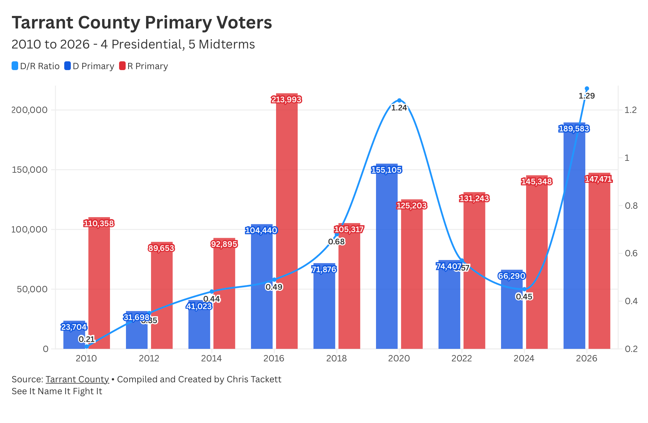
The statewide picture, a D/R ratio of 1.07 and the first time Democrats have cleared 1.0 in a Texas midterm in the modern era, it’s historic in its own right. The March Signal covered that. Three Eras gave us context for where we are at. This piece has a more specific job. The Canary zooms all the way in, to the races that don’t make national headlines but determine who runs the county where 2.1 million Texans live.
This is a look at where Tarrant County can go, on a race-by-race basis for our County level offices. The data is the data. Let’s look at it.
The Regression You Need to See
Before the race-by-race breakdown, one chart needs to be on the table.
I went back through four complete midterm cycles of Tarrant County election data, 2010, 2014, 2018, and 2022, and matched each cycle’s D/R primary ratio against the Democratic share of the November vote in countywide races. The District Clerk race is the cleanest data series because it had a Democratic candidate in every single cycle, which makes it the anchor for the regression.
Here is what four cycles show us: a remarkably consistent linear relationship between where the D/R primary ratio lands and where the November vote lands. In 2010, a D/R ratio of 0.215 produced a Democratic share of 36.5%. In 2014, a ratio of 0.438 produced 40.3%. In 2018, a ratio of 0.680 produced 47.1%. In 2022, a ratio of 0.570 produced 46.3%. The slope is consistent across all four data points. The relationship is real.
Now extend that regression line to a D/R ratio of 1.29.
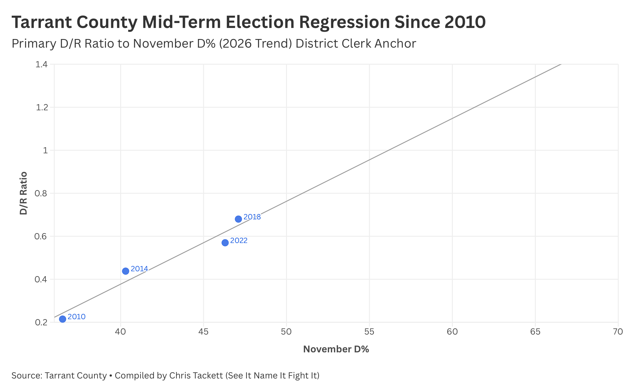
The projected Democratic share at that ratio, before any scenario adjustments, before any candidate quality variable, purely from the regression, lands well above 50%. Like, way above! That 2026 potential data point sits way out there, a huge distance from the four historical observations. It shows exactly how OMG the primary result was. This is not a modest push from the edge of the data. It is a projection into territory that Tarrant County Democratic politics has never occupied.
That regression chart is the honest starting point for everything that follows. Not spin. Not hope. The line connecting four data points and the question of where the fifth one lands.
What the Historical Record Shows
The four-cycle history of Tarrant countywide races tells a story in three movements.
The first movement
is 2010 and 2014, the deepest red period of the modern Tarrant data, a part of Era 2 in the Three Eras piece. A D/R primary ratio of 0.215 in 2010 means that for every 100 Republican primary voters, Democrats produced just 21. Several countywide races had no Democratic candidate at all. The District Attorney office, the County Judge seat, Republicans ran unopposed or against token opposition. Where Democrats did field candidates, they lost by margins of 20 to 30 points. The District Clerk race, contested every time, produced a Democratic share of 36.5% in 2010.
2014 was better but not competitive. The ratio improved to 0.438, and the District Clerk Democratic share rose to 40.3%, consistent with the regression slope. Commissioner Precinct 2 had a Democratic candidate who pulled 43.3%. Commissioner Precinct 4 produced 34.9% for the Democrat. The pattern held: the signal moved, and the November results moved with it, but not nearly far enough to threaten Republican control of anything.
The second movement
is 2018, the beginning of Era 3, the first hint that something structural was changing. The ratio reached 0.680 and the November results followed: District Clerk 47.1%, County Clerk 46.9%, District Attorney 46.7%, County Judge 48.0%, Commissioner Precinct 2 51.6%. That last number is not a typo. Commissioner Precinct 2 flipped. Democrats won it in 2018. Beto O’Rourke carried Tarrant County at the top of the ticket.
But 2018 had a complication that matters for how we read the down-ballot results. Several of those races were extraordinarily close, within one to two points, and didn’t flip. And critically, the Democratic wins at the top of the ticket did not automatically translate down the ballot. The Tarrant County courthouse stayed Republican. The county judge, the district attorney, the clerks, Republicans held them all in 2018 despite Beto’s margin and the more favorable primary signal. Top of ticket performance created the opportunity. It did not execute on it automatically.
The third movement
is 2022, and it is the cautionary data point the projections have to account for. The ratio fell from 0.680 to 0.570, not a collapse, but a meaningful pullback, and the November results fell with it. District Clerk dropped from 47.1% to 46.3%. County Judge from 48.0% to 47.6%. Most races landed in a narrow band between 45.7% and 47.6%. Close. Very consistently close. But not close enough.
The pattern across all four cycles is clear: the signal and the result move together. Every time the ratio went up, Democratic November performance went up. Every time it went down, November performance went down. The regression doesn’t just fit the data. It describes a structural relationship that we have seen hold across twelve years and two distinct political eras in Tarrant County.
The 2026 ratio is 1.29. That’s not a small move from 0.570. It is a seismic one.
Before the Race-by-Race: A Framework for What “Possible” Means
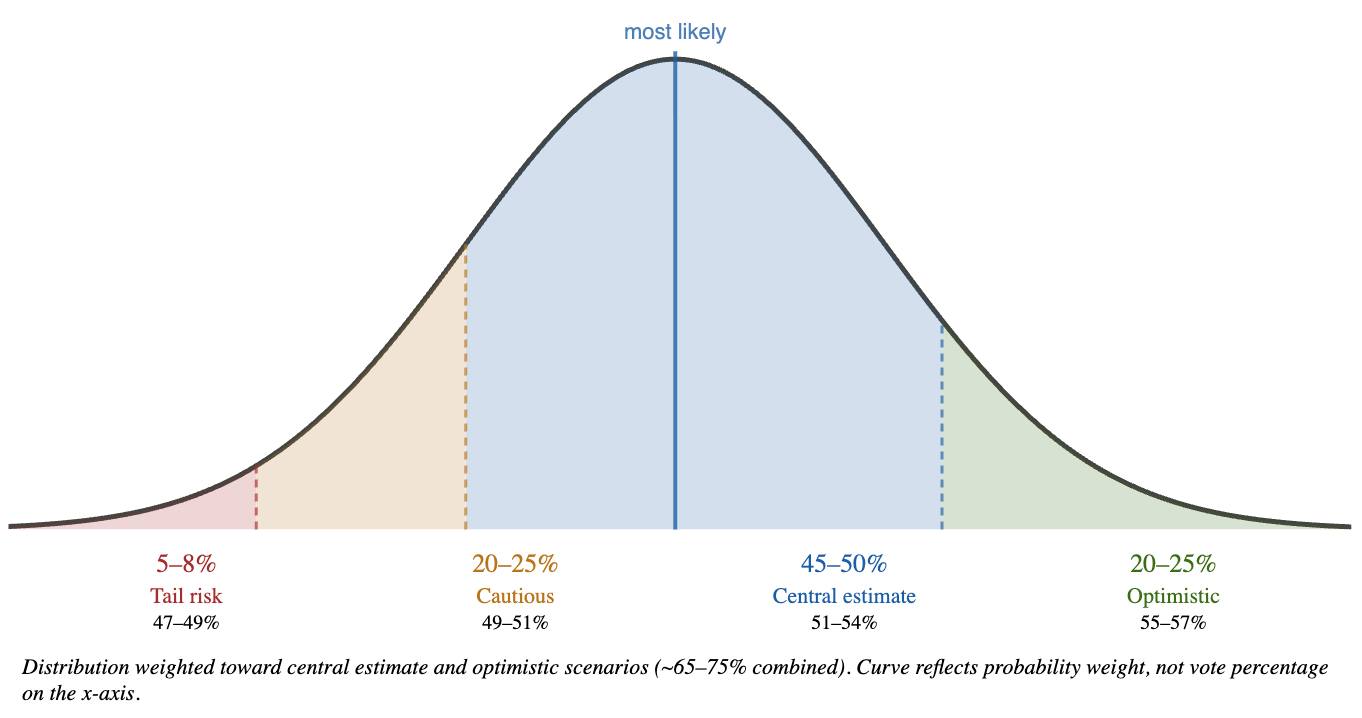
The regression line gives us a projection. But a single projection number, applied to something this far outside the historical data range, it’s kinda stars in your eyes. We need to be honest and look at a range of plausible outcomes, and I’m going to use four scenarios in the race-by-race analysis to try capture it.
Think of them as four different potential answers to the question of how much of the primary energy actually shows up for us in November.
The Optimistic scenario:
We assume the primary coalition converts fully in this one. The women who drove 61.7% of Democratic primary turnout in Tarrant show up in November at comparable rates. The nearly four in ten Democratic primary voters who were new to primaries or new to voting entirely come back and bring people with them. The national environment holds or intensifies. This is the scenario where the primary signal translates without meaningful decay, but still accounts for some level of drop off from the top of the ticket.
The Central estimate:
This is where the regression line actually points, assuming the primary coalition converts at historical rates and the national environment stays roughly where it is. This is not the best case. It is the honest case, grounded in what four cycles of data say happens when the ratio moves this far.
The Cautious scenario:
It assumes some regression from the primary high. New voters return at lower rates. The environment softens modestly. Races that look like comfortable Democratic wins in the Central estimate become toss-ups. Races that look like toss-ups in the Central estimate lean back toward Republicans.
The Tail Risk scenario:
Here we are at the low-probability end of what the data supports, is where enthusiasm decay is significant, the national environment shifts in Republicans’ favor, and some portion of the 2026 primary surge doesn’t convert the way the composition data suggests it will. This isn’t where the data points. But I’ve got to be honest and call it out as a possibility. Even in this scenario, Tarrant County Democratic performance would represent a strong midterm result in our modern data record. It would still be a loss, and losses matter, but the structural shift would still be visible in the numbers.
But Chris, you have told us there are four scenarios! Which one will it be?
If I have to put likelihoods on the four scenarios, here is where the data and probably the more important element, the national environment, point. It’s basically all a bell curve, with the most likely outcomes in the middle of that curve. Tail risk is probably 5 to 8%, the low-probability end of what the data supports. Cautious might be 20 to 25%, because some gap between primary enthusiasm and November conversion is historically normal. Central I’d peg at 45 to 50%. It’s where we have four cycles of consistent data aiming. Optimistic carries at 20 to 25%. That’s higher than it would be normally, just because the national environment is what got us to record turnout in the primary, and well, it’s so outside the norm it’s hard to model, but it doesn’t seem to be going away, so it stands to reason it will actively generate more Democratic turnout.
Add up Central and Optimistic, yeah, that’s 65 to 75% of the probability weight. That’s what the data and trends point to.
BUT, probability and distributions in elections ARE NOT FIXED. The difference between Cautious and Central is almost entirely dependent on what happens between now and November — the candidates, doors knocked, voters contacted, ballots cast. The numbers and math give a range. The organizing dictates where inside it you land.
The race-by-race analysis below gives all four scenarios to each Tarrant County office. The Central estimate is the baseline. The others show you how much the outcome depends on what happens between now and November.
The Race-by-Race Picture
The regression gives us a projection framework. What it can’t tell us on its own is how that framework applies to each individual race, because each race has its own baseline and its own candidate history. Here is my honest race-by-race read.
County Judge
The County Judge race is where Tarrant County Democratic performance has historically been amongst the strongest in the countywide offices, because it tends to attract the most voter attention, at least recently.
2010 - No Dem
2014 - No Dem
2018 - 46.9%
2022 - 47.0%
Apply the regression shift from 0.56 to 1.29 and the central estimate lands in competitive-to-favorable territory for Democrats. The County Judge race is the one most likely to flip in the central scenario, and the one where even the cautious scenario produces a genuine toss-up. If there is one Tarrant County countywide race to watch, this is it.
Optimist - 58.1%
Central - 53.1%
Cautious - 48.1%
Tail Risk - 43.6%
District Attorney
The DA race mirrored county judge in that it had no Democratic candidate in 2010 or 2014. The 2018 and 2022 results, 46.7% and 46.8% respectively, show a stable baseline that has been oh so close without crossing 50%. The 2022 number is actually a tick better than 2018, which suggests the DA baseline has been holding its ground even as primary ratios might have pointed to a minor decline.
2010 - No Dem
2014 - No Dem
2018 - 46.7%
2022 - 46.8%
The central scenario puts the DA race in competitive territory. The 2018 result under a less favorable primary environment was already within striking distance. A 1.36 ratio environment for this race is a completely different context than 2022’s 0.59.
Optimist - 57.4%
Central - 52.4%
Cautious - 47.4%
Tail Risk - 42.9%
District Clerk and County Clerk
These two races are grouped together because they have tracked right together. In 2018: District Clerk 47.1%, County Clerk 46.9%. In 2022: District Clerk 46.2%, County Clerk 45.7%. Both declined modestly in 2022, consistent with the ratio pullback.
The District Clerk is the regression anchor race for this whole thing, which means the central estimate projection for that race is the most directly pulled from the data rather than brought from a similar race. The County Clerk tracks closely and should produce about the same results under any scenario.
2010 - District 36.5%, County 35.1%
2014 - District 39.0%, County No Dem
2018 - District 47.1%, County 46.9%
2022 - District 46.2%, County 45.8%
Both races are in the competitive-to-lean-Democratic range under the central estimate. Both were won by Republicans in 2018 by roughly 6 points despite a favorable environment. The question for 2026 is whether the additional ratio movement, from 0.58 to 1.35 for the District Clerk role and from 0.66 to 1.44 for the County Clerk role, is enough to close that gap. The regression says yes, but only in the central scenario or better.
Optimist - District 57.8% County 59.2%
Central - District 51.8% County 51.2%
Cautious - District 46.8% County 46.2%
Tail Risk - District 42.3% County 41.7%
Commissioner Precinct 2
This is the race with the most interesting history on this list, and the one where there is a critical caveat before the projection, along with an equally important asterisk on that caveat.
2010 - No Dem
2014 - 43.1%
2018 - 51.4%
2022 - 51.5%
Tarrant County redistricted between cycles. The new Precinct 2 map is supposedly seven points more Republican than the map Democrats won in 2018 and 2022. Why supposedly? Republicans drew that seven-point cushion based on 2024 election outcomes, a cycle where the Tarrant D/R ratio was 0.45. In other words, they built a seven-point wall to keep out a Democratic coalition that was showing up at well less than half the rate it just posted in the 2026 primary.
Could be a big “whoops” moment. If the 2026 November electorate looks anything like the 2026 primary electorate, Republicans may have drawn a map that feels good on paper and is very competitive in practice. A seven-point gerrymander drawn off a 0.45 baseline does not survive a 1.29 environment intact. Whether November produces that environment is the question. The primary says the coalition is there. The map assumed it wouldn’t be.
When you draw district lines to protect against a low-turnout Democratic electorate and that electorate shows up in record numbers, the map can backfire. The redistricting is a real headwind and it is worked into the projection. But the Republican majority on the Commissioners Court drew the lines off the wrong baseline, and the 2026 primary is the first hard evidence of how wrong that baseline was.
With a redistricting adjustment applied, the Central estimate for Precinct 2 lands in genuine toss-up territory. The Cautious scenario puts it in Republican-favored range. The Optimistic scenario, the one that most closely reflects what the 2026 primary coalition would produce if it converts fully, brings it back past competitive and it stays solidly blue. This is a race where the environment, the map, and the organizing infrastructure all interact, and where the outcome will tell us something important about how durable the Republican mapmaking advantage actually is when Democratic turnout looks like 2026 rather than 2024.
Democrats know how to win Precinct 2. They did it in 2018 on a friendlier map. The question for November is whether the 2026 coalition (and a 1.24 Primary ratio) is large enough to win it on this one. The primary data says the coalition is there. The map says it will need to be.
Optimist - 55.2%
Central - 50.2%
Cautious - 45.2%
Tail Risk - 40.7%
Commissioner Precinct 4
Precinct 4 is the hardest race on this list to project with confidence, for two reasons now instead of one.
2010 - 33.7%
2014 - 34.9%
2018 - No Dem
2022 - 40.9%
The first is the candidate history gap: there was no Democratic candidate in 2018, and the 2022 result of 40.9% came in a race where the Democratic candidate was running without the benefit of a prior presence in the precinct to build on, and honestly, the candidate wasn’t very active. The second is redistricting. The new Precinct 4 map is roughly a point more Republican than the map used in 2022, a smaller adjustment than Precinct 2 but still a headwind that sits on top of an already challenging baseline.
The same caveat applies here as in Precinct 2: the redistricting was drawn off 2024 turnout assumptions, a cycle that significantly underrepresented Democratic strength relative to what the 2026 primary just produced. A one-point Republican adjustment drawn off a depressed baseline may offer less protection than Republicans anticipated if November looks anything like March.
The 2010 and 2014 data for Precinct 4, 33.7% and 34.9%, reflect the deep-red era baseline. The 2022 jump to 40.9% is consistent with the overall shift, but the starting point is lower than any other race on this list, and the redistricting adjustment pulls the projection baseline down slightly further.
The Central estimate for Precinct 4 lands in the high 40s, meaningful improvement, but it’s the least likely flip on the list even in a favorable environment. The Cautious scenario essentially holds 2022 ground rather than advancing, reflecting the combined weight of the redistricting adjustment and the lower baseline. But, the 2026 Primary ratio was 1.17. Where did Precinct 2 land in 2018 with a 1.10 ratio? 51% for the Democrat.
As with Precinct 2, candidate quality and local organizing matter more here than the structural environment alone. The map and the baseline both require more ground to cover. A strong candidate with precinct-level infrastructure outperforms the projection, potentially by a lot. Weaker ones don’t fully realize what the environment makes possible. Good news is we have a strong candidate in Precinct 4. Looking at you, Nydia!
Optimist - 52.5%
Central - 48.5%
Cautious - 40.9%
Tail Risk - 36.0%
Plot of All of the Races
Here is what all of the various races look like on a scatter diagram, including where the numbers would tell us 2026 could finish. The trend line shows us we are generally right on, with Commissioners in precinct 2 and 4 reflecting the redistricting, so performing below where the trend would have you expect.
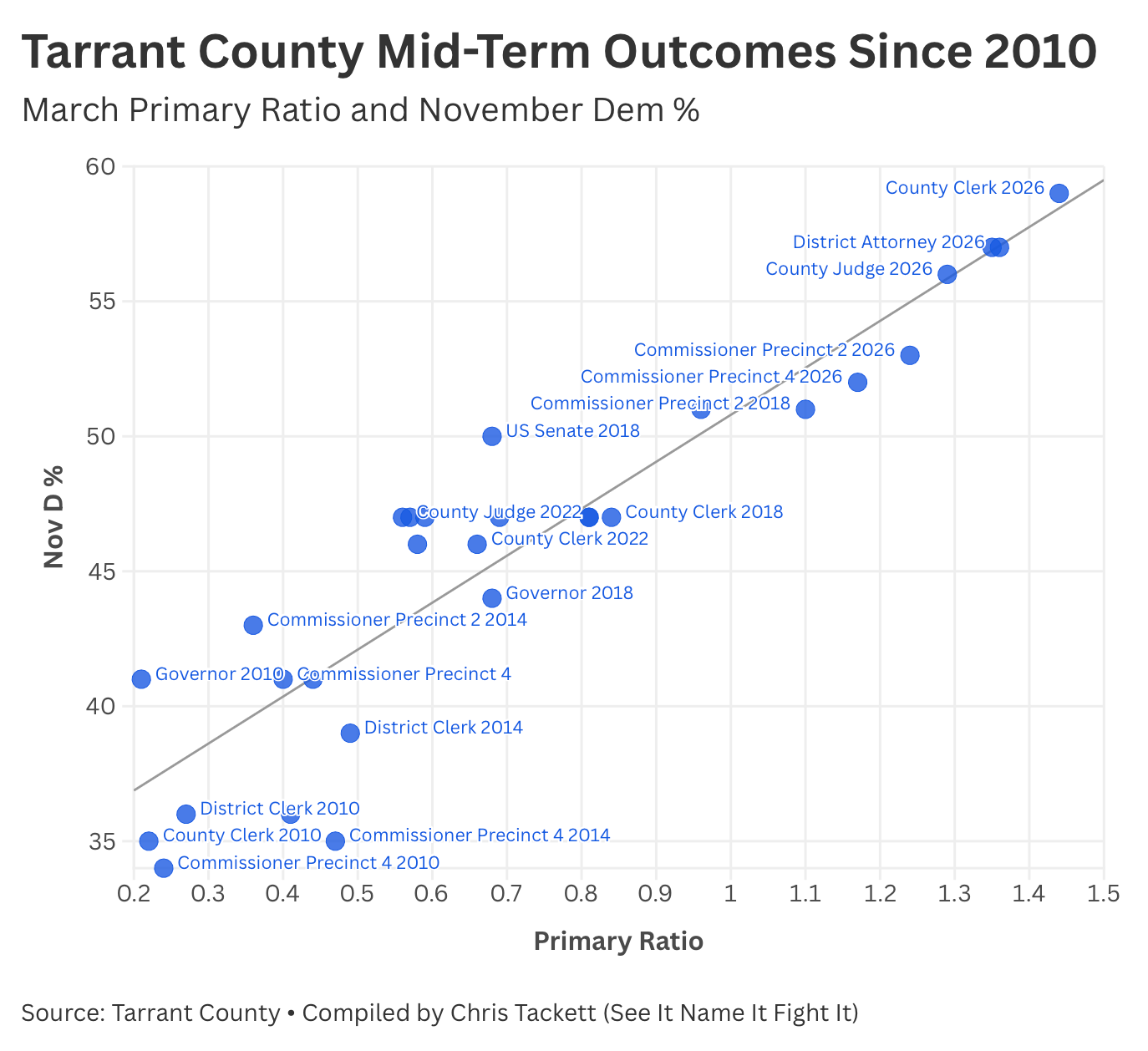
2018 was a surge year, ahead of the trend that was already happening. 2026 is feeling like a surge year too. “Potential” outcomes aren’t in the bag. We might think we are in a good place, but we have to heed a few warnings.
The 2018 Warning and Why 2026 Is Different
The 2018 experience in Tarrant County is the honest check on any projection that assumes a favorable primary environment automatically produces down-ballot wins.
Beto O’Rourke won Tarrant County in November 2018, edging out Ted Cruz. The Democratic primary ratio was 0.68. Even with the Beto win, Republicans held the County Judge seat, the District Attorney office, the District Clerk, the County Clerk, and Commissioner Precinct 4. Democrats won only Commissioner Precinct 2 among the countywide races.
How does that happen? Two reasons, and both of them matter for 2026.
The first is falloff. Even in a strong environment, some voters who mark the top of the ticket don’t mark every race below it. The falloff is typically larger in races where voters are less familiar with the candidates. Most voters in a county of 2.1 million people could not tell you who their District Clerk is, and definitely not who ran against the incumbent. Falloff is real and it is structural. The solution is contested races with visible candidates who give voters a reason to go all the way down the ballot.
The second is margin. Most of those 2018 races landed between 46% and 48%, genuinely close, but not close enough. The environment in 2018 created opportunity. It didn’t create enough margin to overcome the structural Republican advantage in lower-profile countywide races. The ratio in 2018 was 0.68. The ratio in 2026 is 1.29. That is not a slight difference. It is nearly double.
The projection for 2026 does not assume that a favorable environment automatically gifts wins. It projects where the regression line points, and it applies ranges to account for uncertainty. 2018 illustrates it. What the 2026 environment offers that 2018 did not is headroom. Enough additional margin says that even with normal falloff, several of these races land on the Democratic side of 50%.
The work between now and November is to minimize falloff and maximize headroom. That means:
We have contested races at every level
We have candidates who are visible and resourced
We are coordinating efforts to make sure the voters who showed up in the primary know there is a full ballot waiting for them in November, and we invite them to bring friends
The Bottom Line
Four cycles of Tarrant County data produce a regression line. Data. That regression line, extended to a D/R ratio of 1.29, points to the most favorable Democratic environment in Tarrant County countywide races in the modern data record. Data.
Under the Central scenario, the one the historical relationship between primary ratio and November results actually supports, County Judge and District Attorney are the races most likely to flip, with District Clerk and County Clerk in competitive territory. Under the optimistic scenario, the entire slate of countywide races becomes genuinely contested. Under the cautious scenario, the top two are toss-ups and the others are close.
The tail risk scenario, where the primary coalition doesn’t convert and the environment reverts and regresses, is the scenario where 2026 looks more like 2022. The composition of who showed up in the 2026 primary argues strongly against it. These are not Era 1 institutional voters going through their last motions. They are younger, more female, more diverse, and more newly activated than anything in the Tarrant County record.
But zoom out for a moment.
Tarrant County is one county. It is the largest about to be formerly-red county in America, which is why it has served as Republicans’ most reliable talking point about Texas for the better part of a decade. But it is not the whole state. Harris County posted a D/R ratio that moved from 0.89 to 1.84. Dallas went from 1.47 in 2022 to 2.71. Collin County, historically one of the reddest suburbs in Texas, approached parity, moving from 0.46 to 0.93. Denton more than doubled its ratio from 2022, landing at 0.95. The mechanism you just watched work in Tarrant, primary ratio moves and November results follow, operates across every one of those counties simultaneously.
If what you just read about Tarrant made this feel concrete and real, that is the point. The statewide picture operates on the same logic. Just larger. But Tarrant County is the Canary. For this cycle in Texas, it’s the frontline of our democracy.
Every wave needs a place to break first. If you are reading this from a safe blue district anywhere in the country and you want your next dollar to matter, Tarrant County is your answer. Steve Bannon said it: “As goes Tarrant County, so goes Texas. As goes Texas, so goes the World.” He meant it as a warning to his side. We should hear it as a call to action for ours.
Focus here. Invest here. Win here. It’s time.
See It. Name It. Fight It.
The Candidates for the above races:
County Judge - Alisa Simmons https://votealisasimmons.com
District Attorney - Tiffany Burks https://www.tiffanyburksforda.com
District Clerk - Nathan Smith https://nathan4tarrant.com
County Clerk - Lydia Bean https://www.lydiafortexas.com
Commissioner Precinct 2 - Currently in a Runoff
Commissioner Precinct 4 - Nydia Cárdenas https://www.vote4nydia.com
This is fascinating and oh so detailed. You are genius.
My takeaway: we must continue to turn out the vote and continue to amplify these great candidates! Thank you Chris for this analysis and call to action. 👏💪🏻👊💙🗳️💙🗳️💙🗳️💙
Thanks so much for this great data analysis, Chris. My takeaway remains adding the best candidate quality to the equation that l can by getting my name and the names of all the county candidates out there widely.